Sketchy Visualizations that Wow Your Audience!
When Data Visualization Meets Doodles
What is RoughViz?
RoughViz is a Python library that allows us to create rough, hand-drawn style visualizations for your data. It's designed to provide an artistic look to your charts and graphs, making them appear as if they were sketched by hand. RoughViz is particularly useful when we want to create visualizations with a less formal or polished appearance, adding a touch of creativity.
Why use RoughViz for Data Visualization?
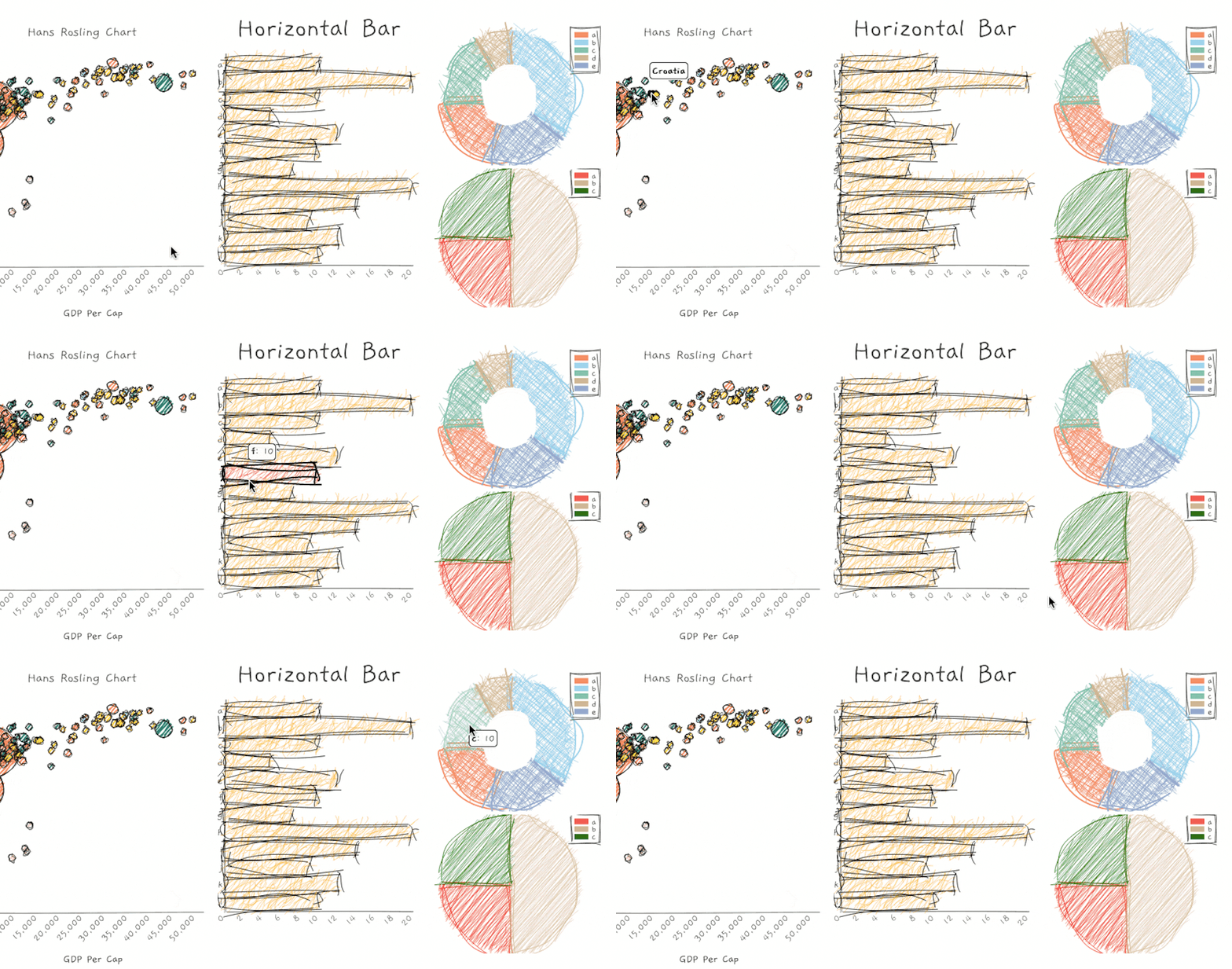
RoughViz applies
rough, hand-drawnstrokes to your charts, giving them an artistic and informal feel.We can customize various aspects of your charts, such as labels, colors, fonts, and styles to achieve the desired
sketchy effect.Despite having a sketchy appearance, they are still
interactive, allowing users tohover over data pointsfor information.
Before We Get Started
At the time of writing this article, RoughViz requires Python >= 3.6
Additionally, RoughViz currently supports only a few charts:
Bar Chart
Horizontal Bar Chart
Pie Chart
Donut Chart
Stacked Bar Chart
But don't worry! The library is soon coming up with some more features and charts:
Line Plot.
Histogram.
Scatter Plot.
Bubble Chart.
Exception Handling.
Advanced CSS control capabilities.
In case you want to know more about it, here are some resources for you to get started:
RoughViz PyPI: PyPI
API Documentation: Documentation
Installation
- Within the pre-activated environment, use the following command to install RoughViz:
pip install roughviz
- Use the following command to install RoughViz in Jupyter Notebook or Google Colab:
!pip install roughviz
Creating a Sketchy Bar Chart
Can't wait any more! Let's start creating interactive and sketchy visualizations.
import pandas as pd # For performing calculations
import seaborn as sb # For loading titanic dataset
import roughviz

titanic_data  = sb.load_dataset('titanic')

class_counts = titanic_data['embark_town'].value_counts().reset_index()
class_counts.columns = ['embark_town', 'Count']

bar_chart = roughviz.bar(labels=class_counts['embark_town'],
                         values=class_counts['Count'],
                         title = "Passenger by Embarking Station",
                         titleFontSize="1.5rem",
                         xlabel = "Embarking Station",
                         ylabel = "Passengers")

But not just this, these visualizations are interactive just like Plotly charts. Have a look at this.

There are many other optional arguments that you can pass to the method. Refer to the documentation to know more.
Creating a Horizontal Bar Chart
RoughViz also allows us to play with horizontal bar charts.
import pandas as pd
import seaborn as sb
import roughviz

# Loading the Titanic dataset
titanic_data  = sb.load_dataset('titanic')

# Grouping passengers by their passenger class
class_counts = titanic_data['class'].value_counts().reset_index()
class_counts.columns = ['class', 'Count']

# Create a horizontal bar chart
barh_chart = roughviz.barh(labels=class_counts['class'],
                           values=class_counts['Count'],
                           titleFontSize="1.5rem",
                          xlabel = "Pclass",
                          ylabel = "Passengers",
                           roughness = 3)

Designing a Sketchy Donut Chart
Here is the code for plotting a donut chart:
# import ....
# Load the required libraries and the titanic dataset as discussed above.

# Calculate the count of passengers by class
class_counts = titanic_data['alive'].value_counts().reset_index()
class_counts.columns = ['alive', 'Count']

# Create a donut chart
donut_chart = roughviz.donut(
    labels=class_counts['alive'],
    values=class_counts['Count'],
    title = "Passenger Survival",
    titleFontSize="1.5rem",
    roughness = 2)

Crafting a Pie Chart
# import ....
# Load the required libraries and the titanic dataset as discussed above.

# Calculate the count of passengers by gender
gender_counts = titanic_data['sex'].value_counts().reset_index()
gender_counts.columns = ['sex', 'Count']

# Create a pie chart
pie_chart = roughviz.pie(labels=gender_counts['sex'],
                         values=gender_counts['Count'],
                         title = "Gender Distribution",
                         titleFontSize = "1.5rem")

Creating a Stacked Bar Chart
# import ....
# Load the required libraries and the titanic dataset as discussed above.

stacked_data = titanic.groupby(['sex', 'alive']).size().unstack(fill_value=0).reset_index()

# Create a stacked bar chart
stackedbar_chart = roughviz.stackedbar(
    labels=stacked_data['sex'],
    values=stacked_data.drop(columns='sex'),
    axisFontSize="1rem",
    title="Survival by Gender",
    titleFontSize="1.5rem",
    xLabel="Gender",
    yLabel="Passengers",
    legend = True,
    roughness = 4
)

Some Considerations and Best Practices
While sketchy visualizations have a unique appeal, they may not be as performant as standard charts, especially with large datasets.
Sketchy visualizations can be
educational and engaging. We can consider using them in teaching or presentations which can convey complex concepts in an approachable manner.RoughViz even allows us to interact with visualizations, such as
hover effects. We can use these features to provide additional information.
Have you experimented with RoughViz or other creative data visualization libraries? Share your insights and experiences in the comments below!
Check out my most viewed article.
Connect with me on LinkedIn.
Subscribe to my newsletter and get such hidden gems straight into your inbox! Happy Data Exploring ^_^